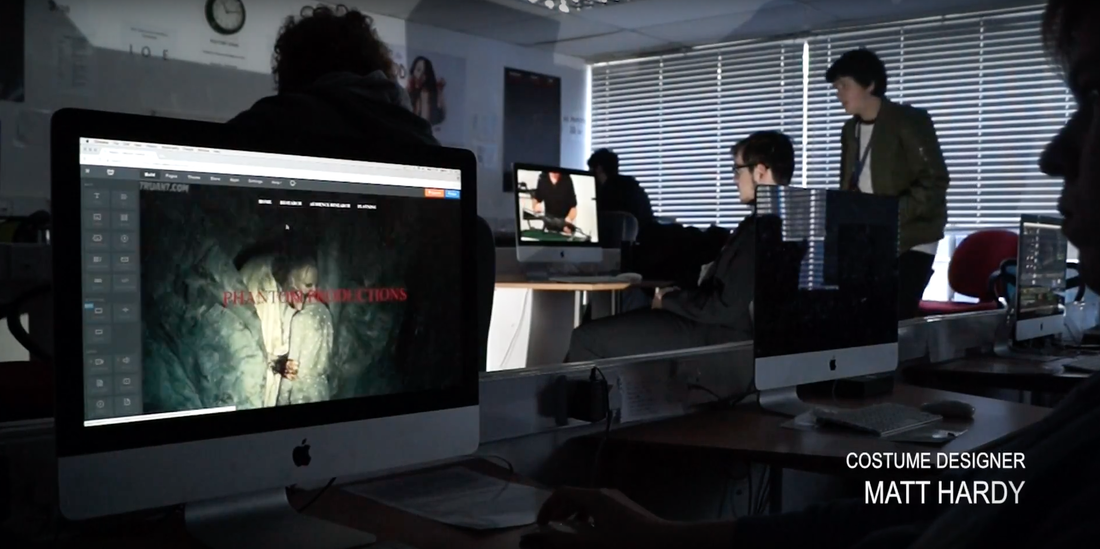
The font choices that we choose throughout our OTS, we choose Arial Narrow and Bank Gothic, we choose these fonts because it looked more generic for school OTS. the reason we chose to have these fonts throughout the OTS clip is because it stands out for someone who is trying to base it off a school where it will look smart but also more of a school like font. the fonts we used throughout our OTS made it look smart as well as a more school like project as well. The font stands throughout the whole OTS trailer so that it is easy for the audience to see it whilst it is going through.
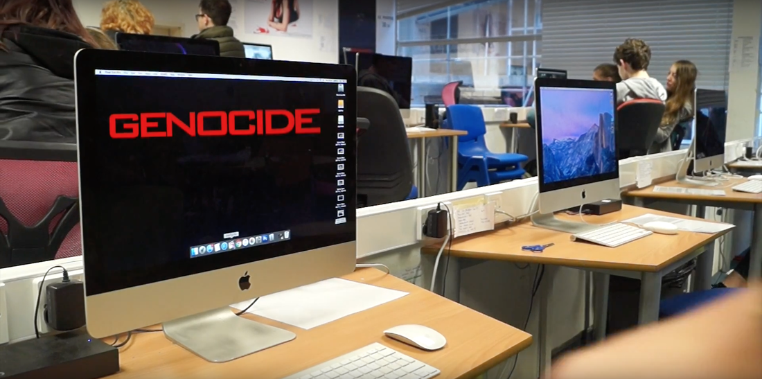
The font that we used for the title "GENOCIDE" made it so that it would stand out on the whole screen where the screen was also the main focus anyway. it grabs the attention of the audience to look that way and read it whilst things might be going on in the background.
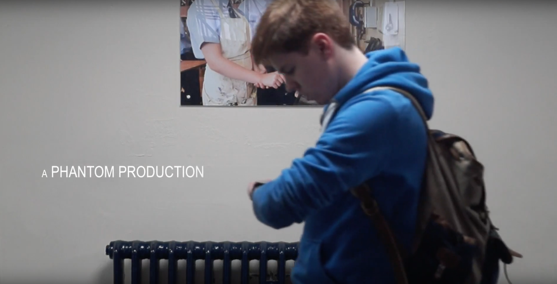
The font on this one is more casual and stands out in the background which means it is easy to read as well as not being to much in the way. The font looks more school casual and not to smart or to stupid and silly.
